"Why do these buttons look different? Why are the link colors not the same? Why is this icon's hover color a different shade of grey?" – Just a selection from the (vindicated) complaints we are all used to hearing from our UX/UI designers, customers, managers, and just strangers that see our app. In the modern web days, these canonical problems are usually solved by utilizing the same CSS classes across pages, or the same components if you are using a component-based library like React or Angular.
But what if your company is a very big one, and has many different products which need to adhere to the same look and feel? What if your app consists of multiple apps, each one developed in a separate codebase, by a different team in a different company? What if you're working on a giant open source ecosystem that consists of over 50 projects, and has over 40 large-scale companies as members? At the Amdocs NFV unit, all of the above applies. As these problems kept hitting us harder and harder, we set on a journey to a better, unified UI world – inspired by a meet-up session with Klarna about their solution.
The problems
UI chaos
Maintaining a coherent-looking UI is a difficult task. This task gets more difficult as the app gets larger – more pages, more developers, and maybe even more designers. Orchestrating all of these people and code pieces together can get cumbersome really fast.
Our app is a multi-microservice application, where each microservice is being developed by a different team, sometimes in a different company. The microservices can be completely different. For example, one may be written in React, and another in Angular. Each team has its own developers and a different designer. As the app grew in scale, the differences started to show up, and many UX/UI confusions ensued. Suffering for all!
Communication?
Our teams didn't have a reliable platform to communicate and talk about UX/UI issues. Conversations were held only by personal cell phones or e-mails. The lack of a centralized space, in which all of the teams' members could be part of the discussion, caused many issues:
- Unawareness of work and discussions that had already been done.
- Monkey patching – this occurs when a developer doesn't have a place to discuss his issues. He will usually try to sort them out by himself, rather than utilizing the power of teamwork, and will probably come up with monkey-patched solutions.
- Unaligned designs – when different designers of the same product are not in constant contact, there is no escaping from an inconsistent look and feel.
Unhappy designers
If there's something that designers don't like, it's when the end result doesn't look like their design. In our situation, it was almost inevitable. We didn't have a "source of truth" to go to, and the designers did not feel in total control of the look and feel of the system.
This may be avoided with certain workflow methods, but it sure does get harder with scale. Whenever decisions are more private and less shared, it usually leads to imperfections in the design. The process of styling review was also cumbersome. The designer had to sit with the developer on his local machine before he pushed his changes – which often took a lot of time and effort.
No customization
Our previous method made it quite hard to customize the designs. Developing the UI components inside our project made it hard to distribute them elsewhere. In order to customize a certain feature, we had to keep multiple CSS definitions – one for every specific case needed - and that obviously doesn't scale too well. As distribution to different customers with different needs is something that happens at Amdocs on a day-to-day basis, this incapability was a major caveat for our team.
The solution
Inspired by klarna/ui, we decided to take a similar approach – a completely separate, independent, collaborative and open source UI library. Together with our collaborators, we opened a GitHub repository. This repository contains two main layers:
- Framework-agnostic HTML & CSS layer – all of the library's components are first implemented using native HTML & CSS, which is the common basis for all future implementations.
- Framework-specific components implementation – JavaScript implementations based on the HTML & CSS layer, one for React and one for Angular.
This structure allows the library to be both untied to a specific framework (the core look and feel is the HTML & CSS), and easily used (the framework-specific implementation allows immediate consumption and integration with the existing codebase ecosystem). When the next UI framework/library will take the world by storm, all we'll have to do is add another specific implementation, utilizing the existing HTML & CSS.
Another key feature we wanted to have is an always up-do-date, realistic and immersive showcase for our UI components. Each new pull request that enters the master branch triggers an automatic deployment to GitHub, which uses storybook (React) and ng2-component-lab (Angular2) to render an updated and fully styled display of all the components. Every designer, developer and product owner knows that this is the place to browse for UI widgets and styles.
All of this goodness is built and tested in Travis CI, and deployed automatically as an npm package upon each new release. The package contains everything needed for full and seamless integration – React components, Angular components, one CSS file that contains all the styles, and all the static assets in use. Now let's go over how this solution helped us solve the problems I described earlier.
UI paradise
With this new approach, our UI can now be completely consistent. Every UI component we use was designed completely by the designers together, and implemented with their close supervision. After the implementation phase, the designers now know that when a "primary outline button" appears in the new screen they are designing, it will look exactly the same – across the whole ecosystem.
For us, the developers, life got easier. We don't need to worry about the styling of every component we put in a new screen. In their designs, the designers can choose from any available component, and we just import it and pass along the specified parameters. Enjoyment for all!
Communication!
Every discussion related to the UI is held on GitHub via issues, pull requests and the wiki. Anyone who is connected to the project is added as a collaborator, and is automatically transcribed to updates in the repository. This way, we have a centralized space for all talks, and everyone is always up to date with the latest information.
A quick example: two designers want to add an exciting new type of button they've been working on – a unicorn rainbow button. They open a new issue, link it to the PSD of the new button on the shared Adobe cloud, and assign it to a developer. The developer will see the issue, and ask any questions he might have on the comments section of the issue. After getting any answers he needs, he will then develop the button. When it's ready, he'll open a pull request that will be reviewed by both another developer and a designer. The reviewers will write any comments they might have in the pull request, and the developer will fix it accordingly. When all is good, the new unicorn rainbow button will be merged to the master and automatically deployed everywhere.
Happy designers
Unified UI makes the designer's life awesome. The awesomeness is both in the development phase and in the usage phase.
In the development phase, doing styling reviews has become a lot easier. Each developer keeps his own fork of the repository. When he is done working on a new component, he will push the new branch to his repository. This branch will automatically be built and deployed to his own fork's GitHub pages (NOT to the main repository). Now his WIP is live online, and he can give a link to the designer for review. Iterations are far easier this way. For more information on our workflow, you're more than welcome to visit our contribution guide.
In the usage phase, the designer knows the end result will look exactly like the design. Because of the easy and informed reviewing in the development phase, the designer won't have any surprises with the end result.
Easy customization
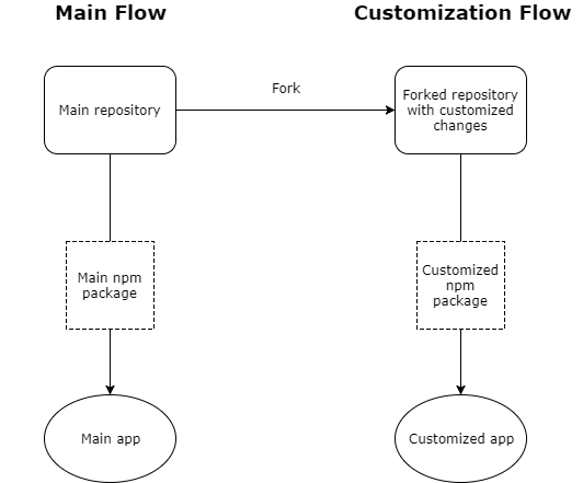
By completely separating the UI library from the product, customization becomes much simpler. Whenever a specific customer or use case requires a customized look, we can just fork the repository, implement the necessary changes, and consume this new package in the desired project. All of the solid infrastructure the project is based on will be there. Only changes to the look and feel will be applied. Forking doesn't mean we lose contact with the main repository. We can always sync our fork with the latest changes, absorbing or overriding what we need. With this method, different groups and teams can use our code for their own special needs – and still enjoy the benefits of our solid foundations.
The following diagram shows the above paradigm:
Disclaimer
We are aware that Amdocs is not the first company to unify its UI. As stated above, we were inspired by Klarna, and also by WIX who have their own fantastic React UI library. This post is meant to show how this approach solved many of our problems. Our experience and implementation is as a large company with many teams, which also contributes to massive open source projects involving other major companies.
Conclusion
We had many issues with our UI consistency. As a large company that works on projects with teams from other companies, we found it hard to manage all the different UI components while keeping a unified look and feel.
By moving our UI library to a separate, open-sourced, collaborative space, we now have much more control over the way our app looks. Both developers' and designers' lives have become easier, and the communication between the teams has gotten way better. Our setup has also become far more customizable. We earnestly recommend UI teams to consider this approach. Feel free to contact us for guidance and help!